One identity, across the experience.
Identity system
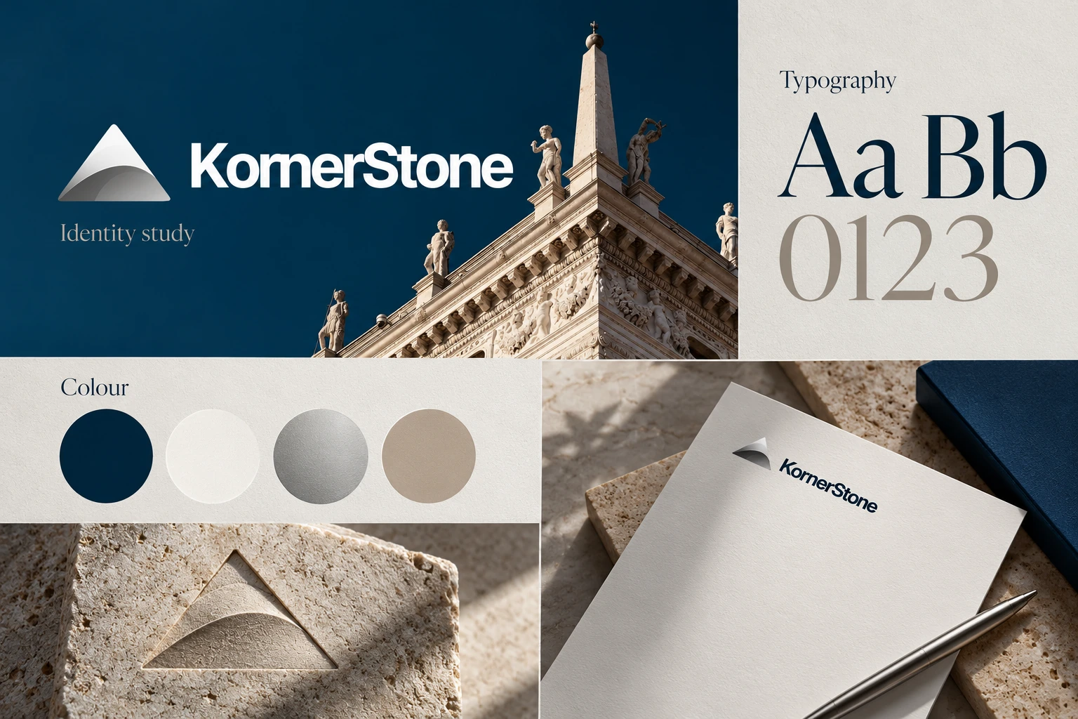
In context

 Let’s talk
SELECTED WORK / BETA
Brand identity and digital presence for a private capital firm specializing in technology acquisitions and growth equity.
THE STARTING POINT
KornerStone Capital needed an identity that could speak to founder-led technology businesses with both credibility and approachability. The opportunity was to give the firm a recognisable character without relying on the familiar language of financial branding.
We began with the idea of a cornerstone: something foundational, deliberate and built for the long term. That principle shaped the mark and the wider visual system.
01 / KORNERSTONE
IDENTITY / APPLICATION
Compare the identity system with the way it appears in the product and its wider experience.
Identity system
In context
THE APPROACH
The pyramid symbol gives the identity an architectural centre. Brushed-metal material, deep navy and a measured relationship between display type and information establish the tone around it.
The same choices need to work in a small digital introduction and in a longer conversation with a founder. We developed the system to give both settings a clear hierarchy and a consistent point of view.
02 / KORNERSTONE
THE WHOLE PICTURE
The engagement connects identity design, visual direction and strategic guidance. Together, those pieces give the firm a practical way to explain itself and continue a relationship across different materials.
The closing gallery studies the mark as a focal point, a graphic element and part of a wider composition. The emphasis stays on the identity rather than on claims about investment performance.
03 / KORNERSTONE
THE WORK, IN DETAIL
A closer look at the identity, the experience and the details around it.