From a 355 ml concept to a slimmer can.
BEFORE · 355 ML
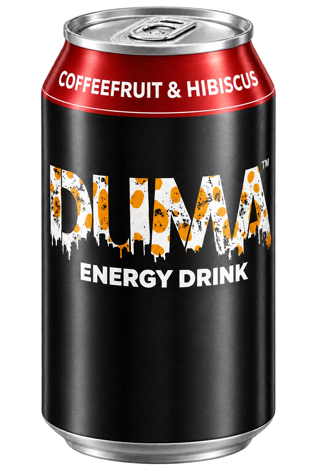
AFTER · SLIM
 Let’s talk
SELECTED WORK / LIVE
Complete brand identity and digital presence for a Canadian energy drink company with a health-conscious mission.
THE STARTING POINT
Duma Energy began with a distinctive product: a hibiscus-based energy drink, a health-conscious point of view and a mission connected to sickle cell awareness. The brand needed to communicate that story with the same confidence as the product itself.
Our brief connected the identity, packaging, e-commerce website and launch content. Each touchpoint needed its own purpose, while still feeling unmistakably Duma.
01 / DUMA ENERGY
IDENTITY / APPLICATION
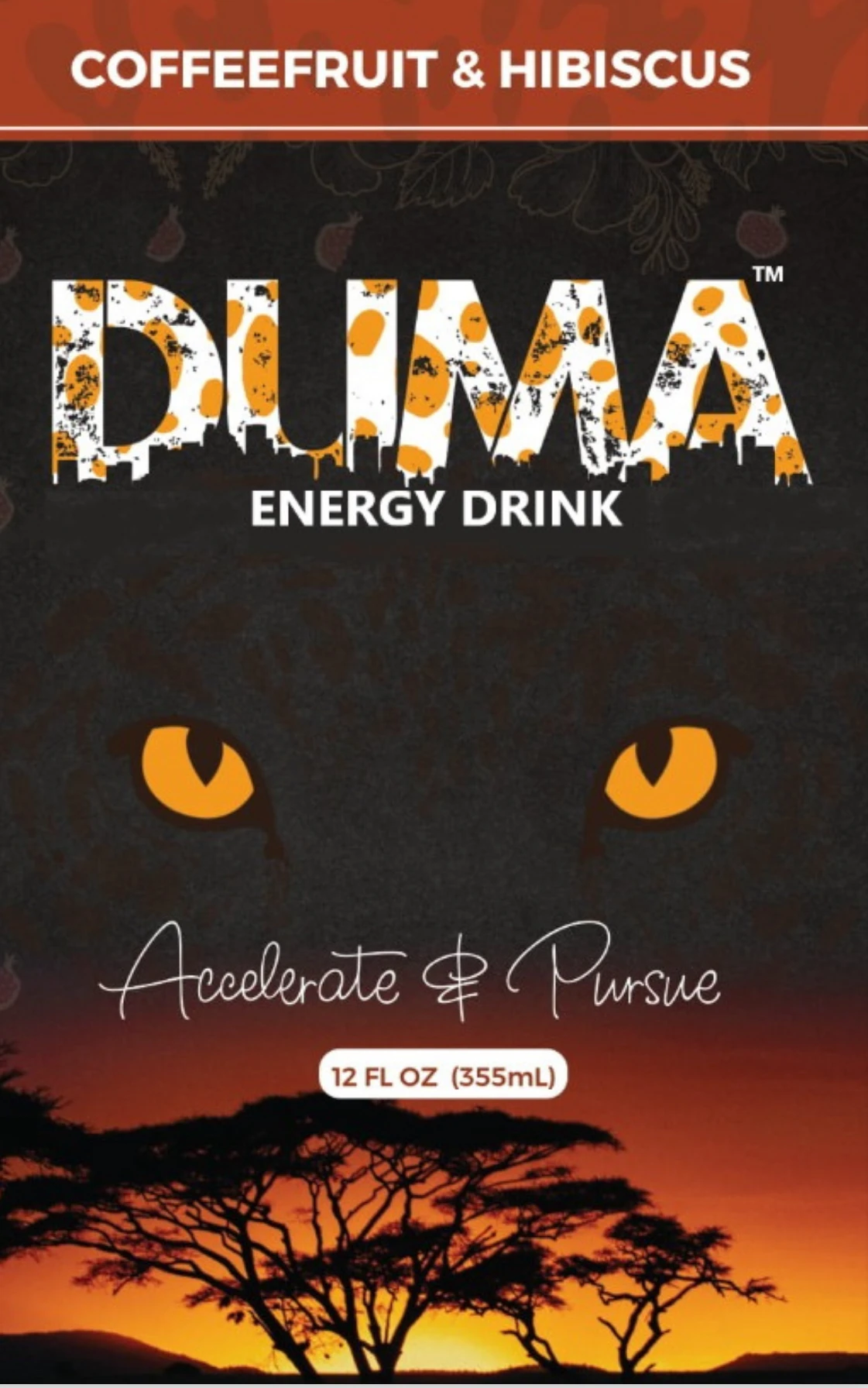
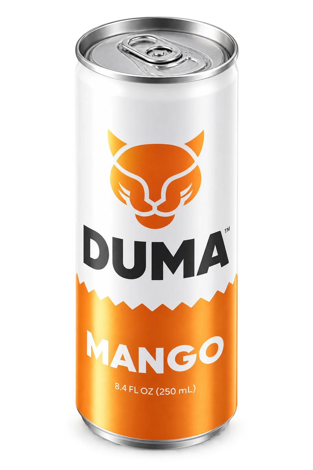
Earlier packaging concepts beside the later slim-can direction. The complete 355 ml can is an interpretive reconstruction from the supplied crop.
BEFORE · 355 ML
AFTER · SLIM
BEFORE · 355 ML
AFTER · SLIM
THE APPROACH
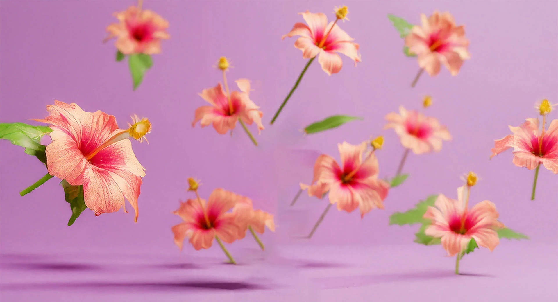
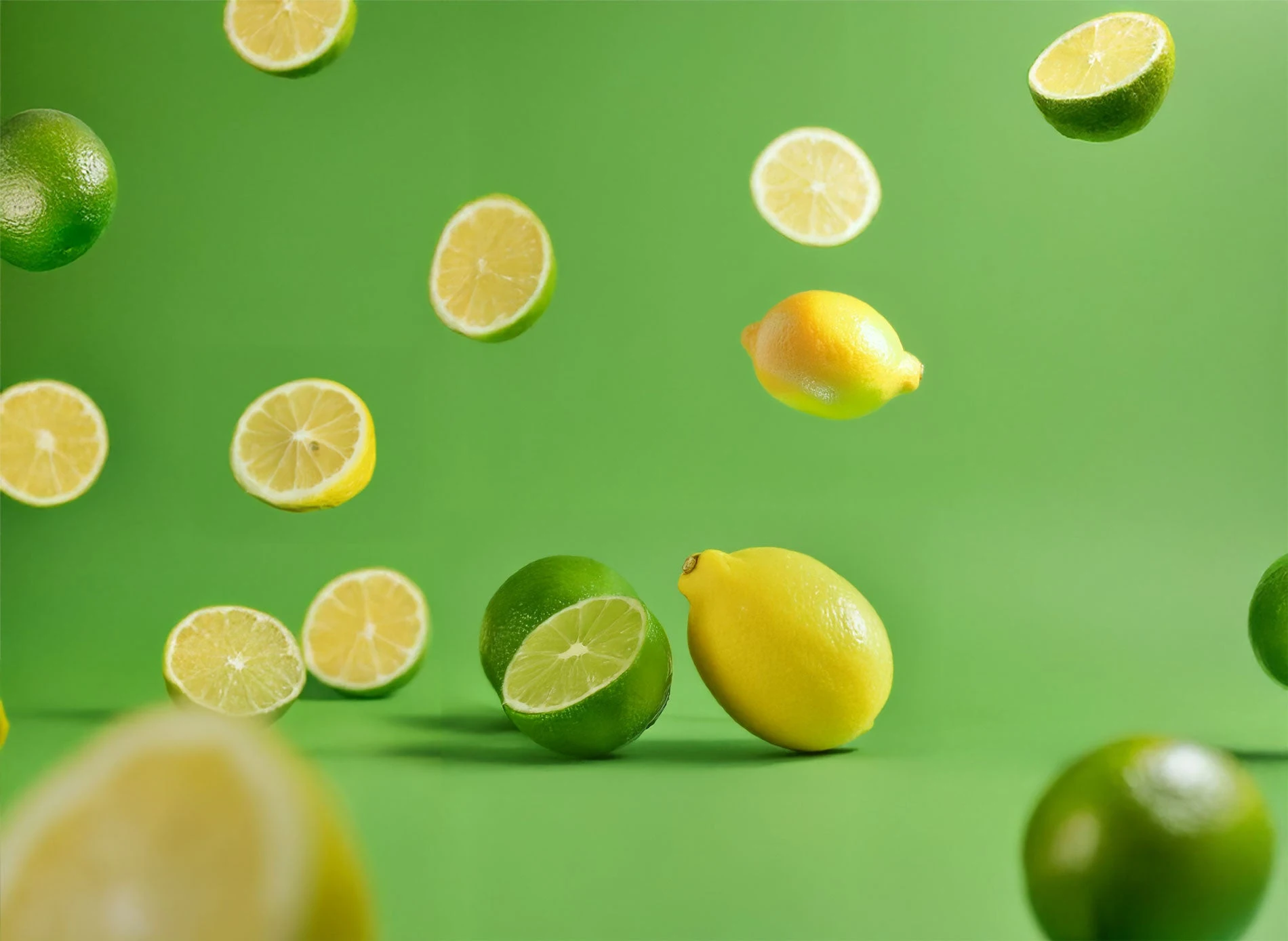
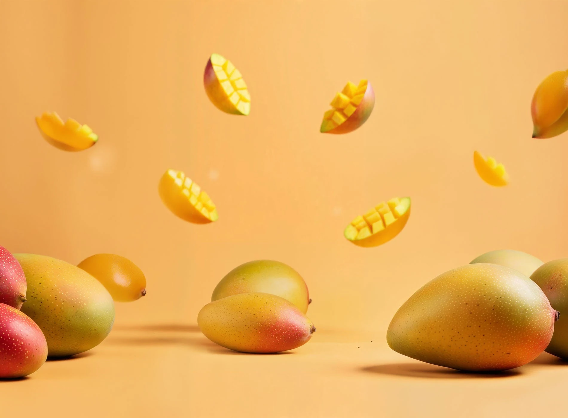
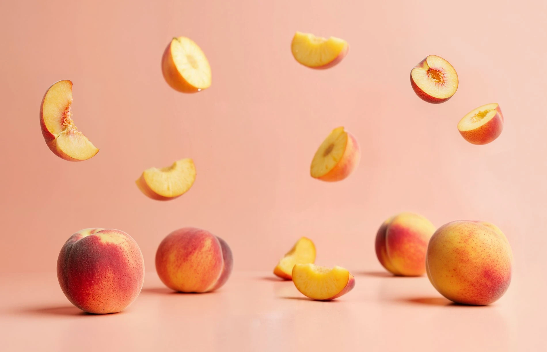
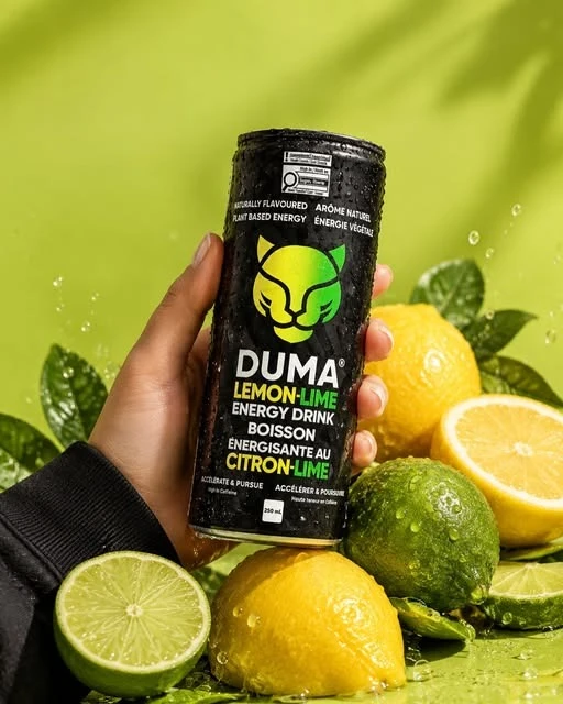
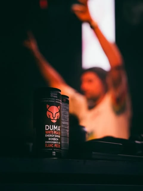
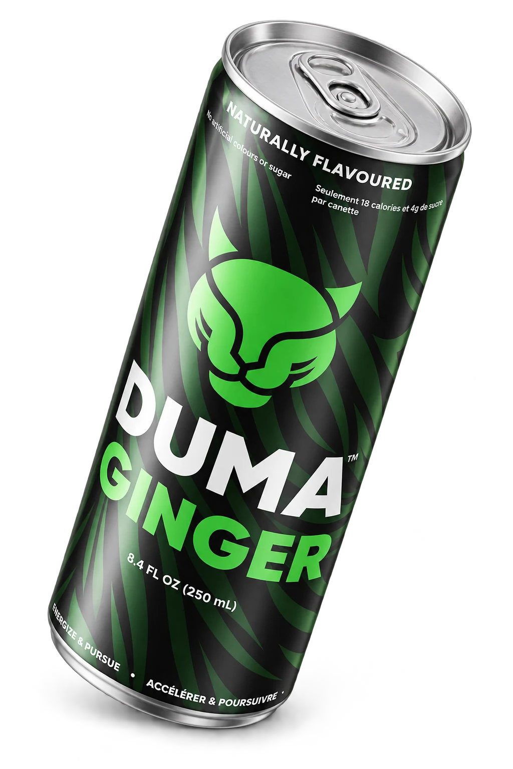
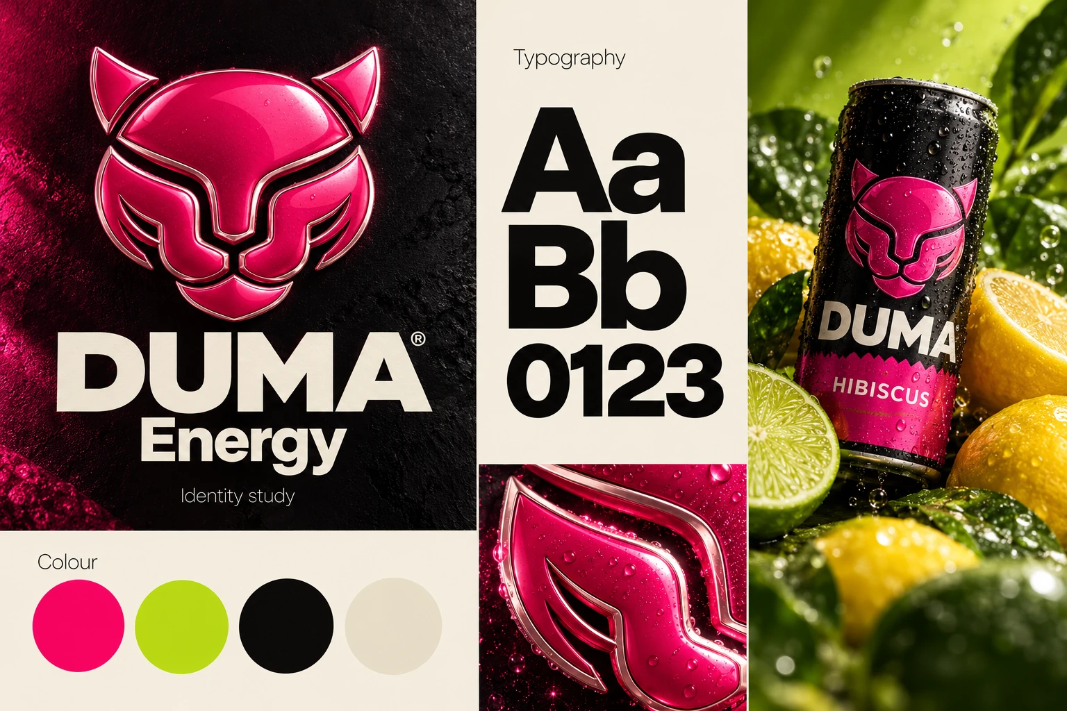
We developed a visual system that gives each flavour a recognisable colour story. Hibiscus established the starting point; lemon-lime, tropical mango and white peach gave the identity room to evolve. The same mark and packaging structure hold the range together.
The website carries that system into a different kind of encounter. Product imagery, clear hierarchy and an inviting shopping experience bring the brand from a physical can to a phone screen. Social creative then takes the same ingredients into launches, retail announcements and events.
02 / DUMA ENERGY
THE WHOLE PICTURE
Duma's founder brought a clear creative point of view to the project. We worked closely through colour, layout and packaging decisions, translating that direction into a cohesive set of digital and physical assets.
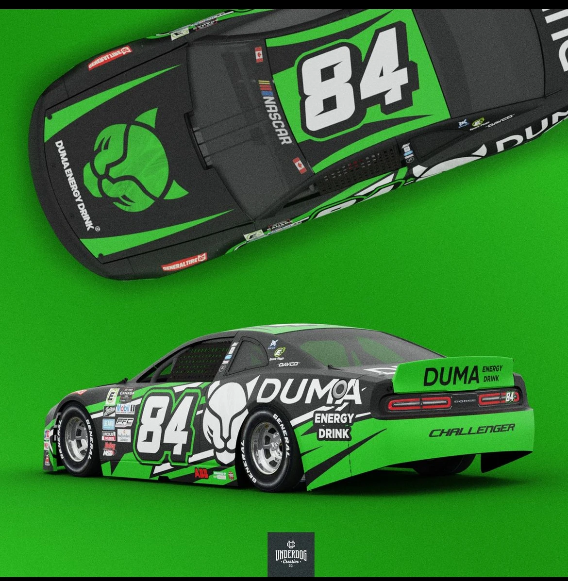
The result is a connected identity across the shelf, the storefront and the feed. The images below bring together the flavour artwork and social creative from that work; the header preserves Duma's original 2025 recap video.
03 / DUMA ENERGY
DUMA ENERGY, ELSEWHERE
THINKING BEHIND THE WORK
THE WORK, IN DETAIL
Flavour artwork, social posts and moments from the Duma archive.